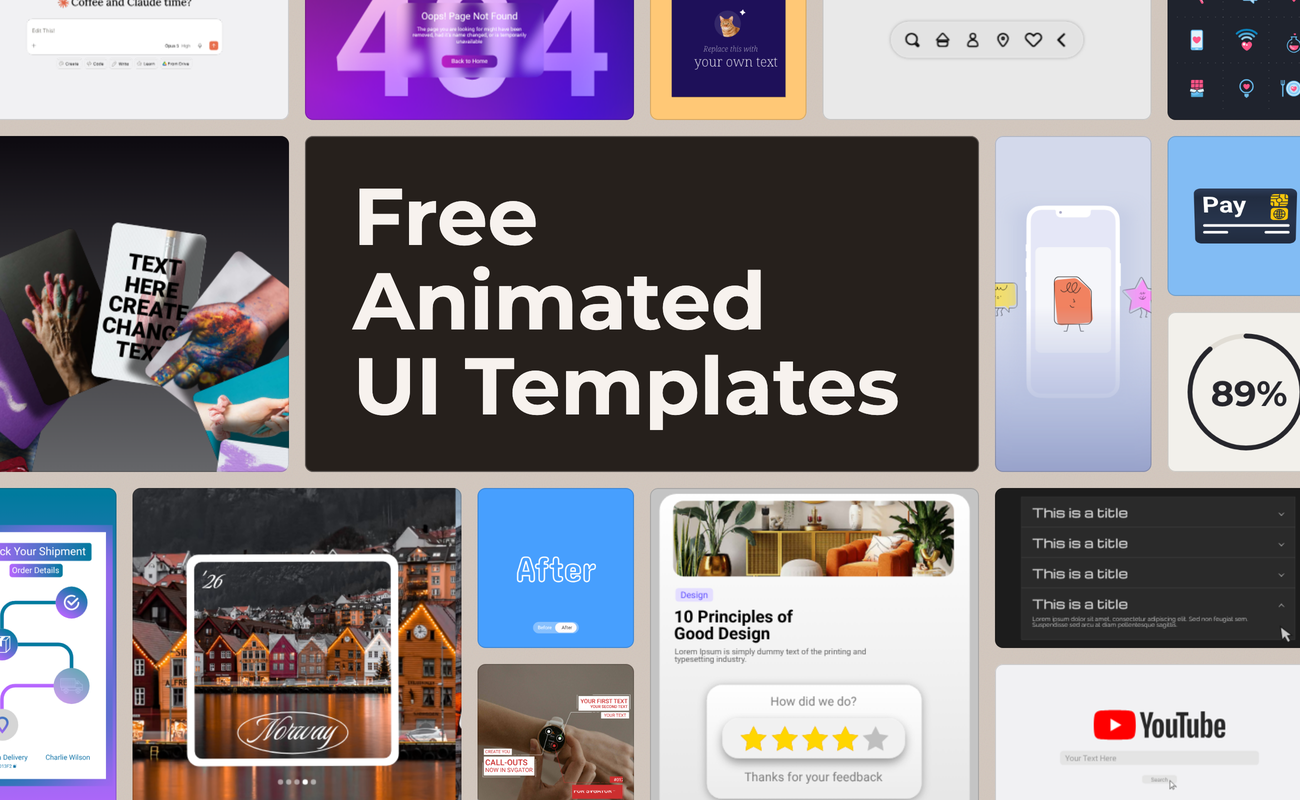
SVGator's animation templates aren't flat files. Each one opens as a working project with the full layer structure, the timeline, and every keyframe exactly as it was built.
That means rewriting labels, dropping in your own screens, and recoloring to match a design system takes minutes rather than a rebuild. All of them are free for commercial use, and the same project exports as SVG, Lottie, GIF, or video. For interface work the first two matter most: both stay sharp at any size and light enough to ship on a page without slowing it down.
Table of contents
- Buttons and micro-interactions
- Icon sets
- Search fields, inputs, and command bars
- Data widgets and dashboard elements
- Image galleries and carousels
- Content cards and feature blocks
- Navigation, tabs, and step flows
- Call-outs and image annotations
- Notifications, empty states, and error screens
- Onboarding and app screen mockups
- Which category to start from
- Final thoughts
Buttons and micro-interactions
A button that responds tells someone their click landed. Hover states, presses, toggles, and sliders turn a flat control into feedback the interface gives back, which is the difference between a design that feels finished and one that feels like a mockup.

Subscribe and like buttons show up a lot, which makes sense given they're among the most clicked controls on the internet. Everything sits on text and shape layers, so matching one to your own brand colors takes seconds.
Before and after - animated toggle button

Card flip - payment method template
Youtube engagement
Icon sets
Static icons do the job. Animated ones do it faster, because movement tells the eye where to look before the label gets read.
Full packs cover communication, files, navigation, e-commerce, and general interface actions, in outline, flat, and filled styles. As SVG they scale without blurring and stay small enough that a whole set costs less than one photo.
Liquid glass animated navigation menu - horizontal
Animated icon pack - communication
Search fields, inputs, and command bars
Search is where most sessions begin, and it's one of the hardest things to demo in a static mockup. An animated field types the query itself, so the whole interaction plays out without a screen recording.
Youtube search - website animation template

Google search - website animation template

Data widgets and dashboard elements
Numbers land harder when they move. A counter that climbs to its final value, a ring that fills, or a bar that grows puts attention on the result rather than the chart around it.

Revenue cards, usage stats, percentage rings, gauges, and full dashboard panels are all covered. Values sit in text layers, so plugging in real figures doesn't mean rebuilding the animation underneath.
Animated statistics widget - multi layout template


Animated analytics card - random shuffle
Animated gauge meter - statistics template
Mobile app feature showcase - animated cards

Image galleries and carousels
Photography needs a frame and a rhythm. A gallery moves a set of images through a layout, one at a time or in groups, so a page can show more than one shot without turning into a wall of thumbnails.

Stacks, fans, grids, sliders with pagination dots, and phone-framed sequences all appear. Every image is a replaceable layer, so a travel gallery becomes a product gallery in one swap.
Website cards - animated roulette template
Bento card shuffle - showcase template

Article gallery iOS - animated blur transition

Double stack image gallery slider - carousel template

Animated search social media motion graphic

Folder - drag to reveal elements

Animated photo gallery - SVG masking
Content cards and feature blocks
Cards are the workhorse of modern layout. Animating them gives a page a sense of order, since blocks arrive in sequence instead of landing all at once and asking the reader to pick a starting point.
Animated star rating - review field template

Animated glass card - slide in & out effects

Social media outro - animated call to action

Animated sidebar checkbox list - animated text


Animated profile card - card flip effect
Navigation, tabs, and step flows
Navigation only works if people can see what changed. Motion carries someone from one state to the next, which is why a tab switch or an accordion feels broken when it simply snaps.
Accordions, dropdowns, tab switchers, sidebars, vertical steppers, and progress flows come with the transition already built. Labels and icons are swappable, and the timing holds up whether you're showing three steps or six.

Scale up cards - animated feature presentation

Folder selection - animated transition

Shipment tracking progress - animated card

Progress steps in animated onboarding flow
Call-outs and image annotations
Pointing at something inside an image is harder than it sounds. A line and a label do it cleanly, arriving in order so the eye follows a path instead of scanning the whole frame.
Animated callout blocks - product descriptions

Smooth animated callout block

Animated vertical process steps - video overlay

Animated callout block - zoom-in on product

Notifications, empty states, and error screens
The unglamorous screens get skipped in most design work, which is exactly why they're worth animating. A 404 with movement keeps someone on the site a few seconds longer than a dead end does.
Empty state animation - 404 page

Coming soon countdown template

Onboarding and app screen mockups
First impressions of an app happen in about three screens. An animated onboarding sequence shows them moving, which reads far closer to the real product than a row of static frames.
Phone carousel template - vertical animated shuffle

Animated mobile screens - ad campaign showcase

Animated category screen

Mobile UI scroll preview

Which category to start from
| Category | What it does | Best for |
| Buttons and micro-interactions | Gives a control visible feedback | Prototypes, design systems, end screens |
| Icon sets | Directs attention before the label is read | Navigation, menus, feature lists |
| Search fields and command bars | Plays out a search without a screen recording | Hero sections, demos, onboarding tours |
| Data widgets and dashboards | Puts attention on the number, not the chart | SaaS pages, reports, investor decks |
| Image galleries and carousels | Shows many images without a thumbnail wall | Portfolios, travel, e-commerce, case studies |
| Content cards and feature blocks | Sequences a layout so it reads in order | Landing pages, pricing, testimonials |
| Navigation, tabs, and step flows | Makes a change of state visible | FAQs, settings, forms, checkout |
| Call-outs and image annotations | Points at one detail inside an image | Product tours, tutorials, help docs |
| Notifications and error screens | Turns dead ends into something watchable | 404s, alerts, launch and waitlist pages |
| Onboarding and app mockups | Shows an app moving instead of sitting still | Store listings, launch pages, pitch decks |
Final thoughts
Every template in the UI elements tag is a starting point, not a finished component. The build is already done, so your time goes to the copy, the colors, and the sizing your interface needs. Open one in SVGator, replace what's yours, and export it as SVG or Lottie for the web, or as video for social media.
There's a second route if you'd rather not do the swapping by hand. SVGator's MCP integration connects the editor to an AI assistant, so you can open a template as a project and ask for the edits in plain language: rewrite the labels, recolor the layers, duplicate it into a set of variants, export the lot. The assistant works on the actual project, which means everything stays editable in SVGator afterward.