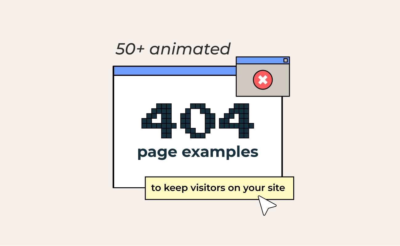

A 404 page is what loads when someone follows a broken link or lands on a page that no longer exists. Plain versions read like a closed door. An animated 404 page turns that same dead end into a few seconds of personality, which is often enough to keep a visitor on your site instead of leaving for good.
This guide sorts 404 page animation ideas into clear categories, from character-led pages to themed, interactive, and SaaS-focused designs, along with best practices for the page-not-found moment you are designing for.
Table of contents
- Key takeaways
- What is a 404 page animation
- SVG, GIF, or video: picking a format for your error page
- Error pages with characters and mascots
- Themed 404 pages that match your brand
- Game-inspired and retro 404 pages
- Funny and playful 404 pages
- Interactive 404 pages
- Minimalist 404 pages
- 3D and experimental 404 pages
- Error pages for SaaS
- Error pages for portfolios and creative agencies
- Best practices for 404 error pages
- Final thoughts
Key takeaways
- A 404 page loads on a broken or deleted link, and an animated one explains the error plainly, points to a next step like a home link or search box, and carries the brand's tone.
- SVG stays sharp at any size with small files and animates via CSS or JavaScript, GIF runs everywhere but is heavy with limited colors and no interactivity, and MP4 or WebM stays lighter than GIF but needs autoplay and controls handled.
- The redirect is the real job of a 404 page, so a lightweight animation that loads instantly, respects reduced-motion settings, and stays readable on mobile beats a heavy file.
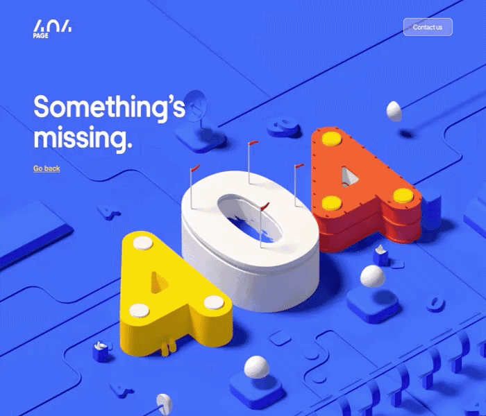
What is a 404 page animation?
A 404 page loads when a link is broken, or a page has been moved or deleted. The plain version states the error and stops there, while an animated 404 page adds motion and a clear way forward.
That small animated change does three things well:
- It explains what happened in plain language, so visitors are not left guessing.
- It points to an obvious next step, usually a link back to the home page or a search box.
- It carries the brand's tone, whether that is playful or minimal.
The same thinking applies to other error pages too, from a 500 server error to a scheduled maintenance screen.
SVG, GIF, or Video? (Picking a format for your error page)
The right format depends on how complex your animation is and how much you care about file size.
Here is a quick comparison of the three you will run into most often, starting with the scalable vector format built for the web.
| Format | Best for | Keep in mind |
| SVG | Crisp vector illustrations, icons, and interactive 404 pages | Stays sharp at any size and keeps files small. Animate it with CSS or JavaScript. |
| GIF | Dropping a quick animated 404 into almost any page | Works almost everywhere, but files get heavy, colors are limited, and there is no interactivity. |
| Video | Detailed or photographic motion | Smaller than a GIF, though autoplay and controls need handling. |
a. Error pages with characters and mascots
Characters are the most reliable way to soften a not-found moment, because a friendly face is hard to stay annoyed at. Animals, people, and brand mascots all work, and even a simple loop, like a walk cycle or an idle animation, gives visitors something to watch while they decide where to click next.
A character can also model the next step, gesturing toward a button or visibly searching for the missing page, which makes the redirect feel like part of the story rather than an instruction.


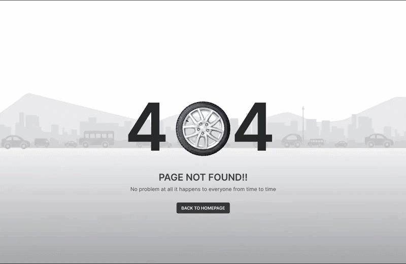
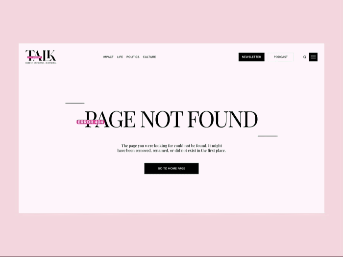
b. Themed 404 pages that match your brand
A themed 404 page borrows a concept from the brand itself and stretches it into the error message. The visual idea connects directly to what the company does or sells, so the page reads as a natural extension of the site rather than a generic apology.
This approach suits brands with a strong identity or a distinctive product, since the theme does double duty: it entertains, and it reinforces what you are known for. The more specific the theme, the more memorable the page tends to be.


c. Game-inspired and retro 404 pages
Nostalgia is a quick route to a smile, which is why arcade, platformer, and other retro game motifs show up so often on error pages. Some go further and turn the 404 into a small playable moment, giving visitors a reason to linger that feels intentional rather than accidental.
This style fits gaming platforms, entertainment brands, and any audience that grew up with classic consoles. Keep the path home visible, so the fun never gets in the way of the redirect.


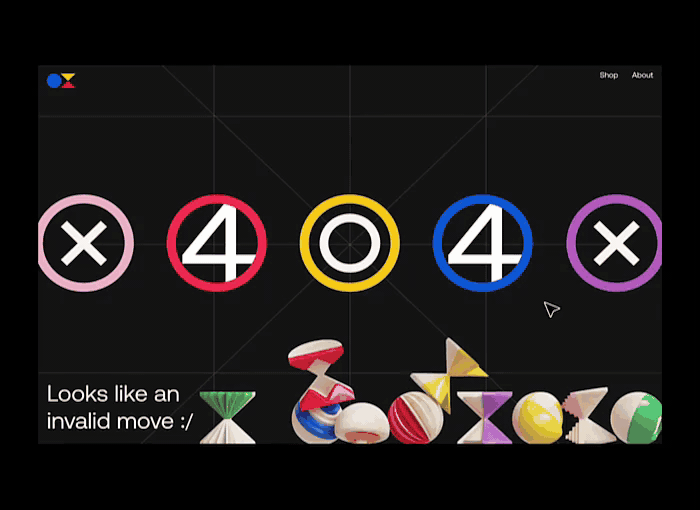
d. Funny and playful 404 pages
Humor is one of the fastest ways to defuse a not-found moment. A joke, a pun, or a self-aware gag turns a small failure into something a visitor might want to share, and a quick laugh buys you a few extra seconds before anyone reaches for the back button.
This style works for brands with a relaxed, approachable voice and broad audiences, since lighthearted humor rarely offends. The trick is to land the joke fast and still make the way home obvious, so the fun never gets in the way of the fix.


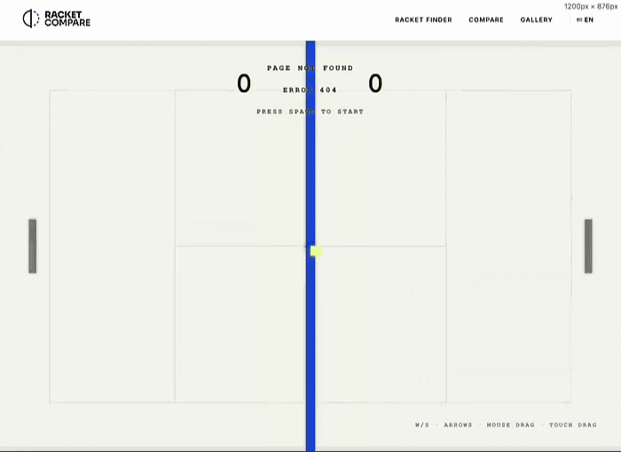
e. Interactive 404 pages
An interactive 404 page invites visitors to do something, whether that is dragging an element, clicking to trigger a reaction, or playing a quick game. The action shifts attention away from the error and onto the page itself, which can turn a frustrating moment into a curious one.
Interactivity works best when the action is obvious, and the way back is just as clear. Most performance advice warns against giving people a reason to stay on an error page too long, so pair the playfulness with a prominent link home.

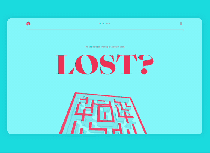
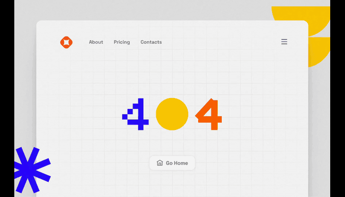
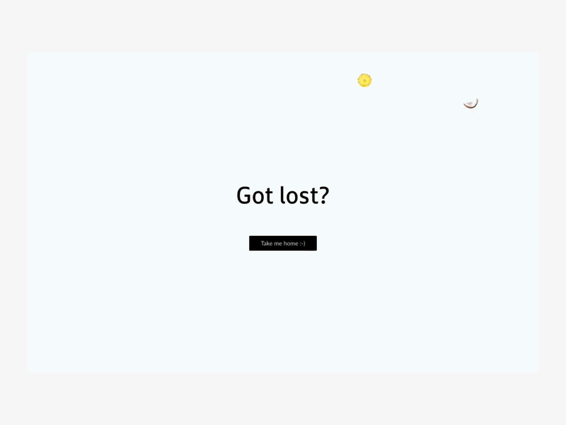
f. Minimalist 404 pages
Not every error page needs a full scene. A minimal 404 page leans on type, a single shape, or a small motion accent to get the message across without much weight. Glitch effects fit neatly here, since a flicker or distortion is instantly readable as something has broken.
This style suits brands with a clean, restrained look, and it is friendly to performance because the files stay small. A lightweight 404 SVG animation or a short loop is often all it takes.

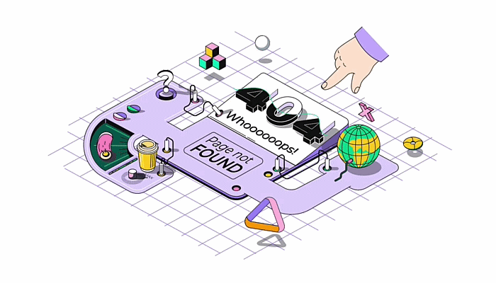
g. 3D and experimental 404 pages
For brands that want to push past flat illustration, a 404 page is a low-risk place to try something unusual. Three-dimensional scenes, bold motion experiments, and offbeat art styles all have room here, since visitors do not arrive with fixed expectations.
Treat this as a sandbox. If you have been meaning to test more dimensional graphics or a new visual direction, the error page is a forgiving spot to start, as long as the message and the way home stay clear.

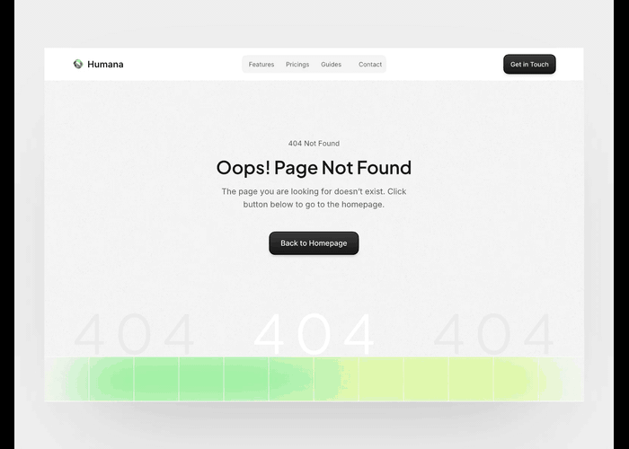
h. Error pages for SaaS
Product teams treat the 404 page as part of the app, not a separate afterthought. The error state matches the interface, keeps the same components and tone, and routes people back to the dashboard, a key feature, or a search rather than the marketing home page.
For SaaS and web apps, clarity matters more than spectacle: a quick animation plus a useful link beats a long scene that slows the recovery. Fintech, productivity, and design tools all benefit from an error page that feels like a calm, in-product moment.


i. Error pages for portfolios and creative agencies
A portfolio or agency 404 page is a chance to show off, since the people landing on it already care about design. These pages tend to go bigger, with full-screen scenes, bold motion, or interactive flourishes that double as a sample of what the studio can do.
The error becomes part of the showreel, so it is worth a little extra polish. Just keep one clear exit, usually a click-anywhere prompt or a link back to the work, so visitors who came to browse can get straight to it.


Best practices for 404 error pages
Style gets people to smile, but a few fundamentals decide whether a 404 page actually does its job. These apply to any category above, and to other error pages as well.
- Say what happened in plain language
Tell visitors the page is missing in plain, human words, without technical codes or finger-pointing. A short, friendly line lands far better than a cryptic error message, and it sets the tone for everything else on the page.
- Give visitors a clear way back
Always include an obvious exit: a link to the home page, a search box, or a few popular pages. The redirect is the real purpose of a 404 page, so the route forward should be the easiest thing to find on the screen.
- Match the animation to your brand
Use the same colors, tone, and characters as the rest of the site. A 404 page that feels on-brand reads as intentional, while a mismatched one can make visitors wonder whether they have landed somewhere broken or unsafe.
- Keep the file lightweight
A 404 page should load instantly, even when the rest of the site is having a bad day. A small 404 SVG animation or a short loop keeps things fast once the file is trimmed down, while heavy GIFs or video can slow the very recovery you are trying to speed up.
- Entertain, but don't trap visitors
A little personality is good; a maze is not. Give people a reason to smile, then point them onward. The goal is to get visitors moving again, not to keep them parked on the error page admiring the animation.
- Design for mobile and accessibility
Make sure the page works on small screens, the text stays readable, and the animation is not the only thing carrying the message. Respect reduced-motion settings for visitors who prefer less movement, and add alt text where it helps.

| Best practice | What it means |
| Say what happened in plain language | Tell visitors the page is missing in clear, human words, with no error codes or blame. |
| Give visitors a clear way back | Add an obvious exit: a home link, a search box, or a few popular pages. |
| Match the animation to your brand | Use the site's colors, tone, and characters so the page reads as intentional. |
| Keep the file lightweight | Favor a small 404 SVG animation or short loop so the page loads instantly. |
| Entertain, but don't trap visitors | Add personality, then point people onward instead of keeping them parked. |
| Design for mobile and accessibility | Work on small screens, keep text readable, and respect reduced-motion settings. |
Final thoughts
Sorting your error pages by style makes the design call easier: pick the category that matches your brand, layer in the basics above, then commit to it. Whatever you choose, the goal holds across every type here, which is to acknowledge the slip and give people a clear way back.
When you are ready to build one, a vector-based tool like SVGator keeps files light and the workflow code-free, so a 404 page can do real brand work instead of sitting there blank. Choose a direction, and a missed click turns into a reason to stay.