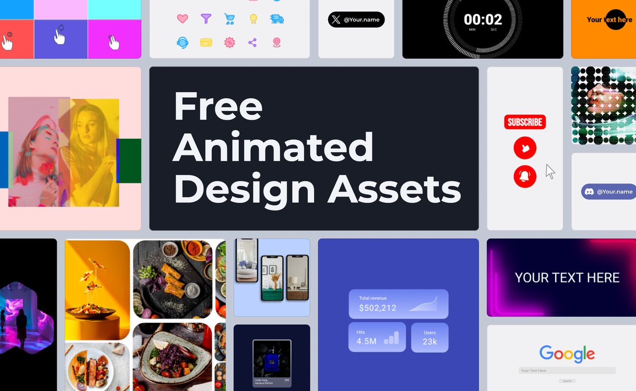

Design assets are the moving parts that sit on top of something else. A handle badge in the corner of a reel, a subscribe button that pops in before the outro, a notification sliding into a product demo, an icon set running down the side of a dashboard. None of them carry a piece on their own, and all of them decide whether it looks finished.
The Assets tag collects them as editable projects rather than finished exports. Open one from the animation templates library and the layer structure, the timeline, and every keyframe sit exactly where the animator left them, so retyping a handle or matching a badge to your brand color takes a couple of minutes. All of them are free for commercial use, the same project exports as SVG, Lottie, GIF, or video, and anything built to sit over footage exports with a transparent background.
Table of contents
- Social handle reveals
- Subscribe, like, and notification prompts
- Lower thirds, outros, and video overlays
- Animated icon sets
- App and interface elements
- Dashboards, carousels, and card layouts
- Backgrounds, masks, and transitions
- Rewards and success states
- Final thoughts
Social handle reveals
Handle badges are the largest group in the tag, and they all run the same system. Each platform gets a light badge and a dark badge, and most come in a full-color icon version plus a monochrome one.
The variants exist because footage does. A white badge disappears against a bright product shot while the dark version holds its edge, and a monochrome icon stays readable when the frame already carries four other colors. Instagram, YouTube, TikTok, Discord, and X are all covered. The handle sits on a normal text layer, so one project covers a whole team once everyone retypes the name.
Reels, Shorts, video outros, stream overlays, and collab shoutouts are the obvious placements. A few of them animate the badge itself rather than just fading it in: the gradient sweep runs the Instagram brand gradient across the badge, and the black fade version brings it in with a slower, quieter entrance. Both are worth using when the handle is the only thing on screen.
Instagram handle reveal light mode color

YouTube handle reveal dark mode color

TikTok handle reveal light mode color

Discord handle reveal dark mode color

Subscribe, like, and notification prompts
This group animates the YouTube interface itself. A Subscribe button gets pressed and flips to Subscribed. A thumbs up fills in while the counter ticks from one number to the next and back. The bell menu opens after a subscription and steps through All, Personalized, and None.
Rebuilding that sequence by hand eats an afternoon, and a screen recording of the real thing brings your own channel, your own subscriber count, and whatever notification happened to be on screen that day. Color is the second reason to reach for these. Alongside YouTube red there is a pink theme and a black and white version, both of which sit better in a branded video that would clash with the red.
Layout follows placement. The vertical stack of Subscribe, thumbs up, and bell fits Shorts and any 9:16 frame, while the horizontal row suits end screens and 16:9 outros. The generic CTA button set covers the same job outside YouTube, on Instagram or a landing page highlight.
Youtube engagement - animated subscribe button confirmation
Youtube success state template - subscribed youtube red
Youtube engagement - animated notification options

Youtube engagement - like vs dislike animation
Youtube engagement - vertical youtube subscribe thumbs up bell button

Animated CTA buttons for social media engagement

Lower thirds, outros, and video overlays
Handle badges tag a video. These carry information across it. A lower third names the person talking, an outro card closes the piece with a profile and a follow prompt, a process overlay walks through numbered steps while the footage keeps playing underneath.
Most of them are built for a transparent export, which is the part that’s important once you’re in the edit. Drop the file onto a track above your footage and it composites without a matte, and because the source is vector you can set the export resolution to whatever the timeline needs.

The text pieces work differently from the rest of the group. The negative mask template cuts the headline out of a moving shape so the type appears through it rather than on top of it, and the neon strobe background pulses behind the text instead of over it, which suits event and music posts. The countdown timer sits at the front of a video rather than the end, ticking through numbers into the opening scene.
Animated name and title - minimalist lower third

Animated Youtube outro - custom channel asset
Animated vertical process steps - video overlay

Animated negative mask effect - text reveal
Neon background with text element - neon strobe lights
Animated icon sets



Each of these is a full set in one project rather than a single icon. Six hand gestures with their own accent colors, three communication packs, a file and document group, a dashboard basics group, a duotone ecommerce set, and a Valentine's set for seasonal work.
Animating a set by hand means matching timing across every icon so the group reads as one system, and that is the work already done here. Motion style is what separates them. The bouncy and doodle sets use springy overshoot with a lot of personality, while the file, document, and dashboard sets animate the stroke with tighter easing that suits an admin panel.
Because they arrive as packs, you can pull one icon out of the project and delete the rest, or keep the whole set and stagger it across a feature row. The icons tag holds more of them if the style you need is not in this group.
Animated hand gesture icons
Animated SVG icons - files and documents
Animated ecommerce icons - duotone
Animated doodle icons - retro pop icon set
App and interface elements
These rebuild familiar product UI as animation. A Slack message drops into its aubergine sidebar, an AI chat bar types a prompt and pops its Create, Code, Write, and Learn chips into place, a search bar fills in a query and cues up the results below.
Screen recordings of real products age badly and pull in whatever else was on screen that day. Animating the interface keeps every color and every line of copy under your control, and a vector file stays small enough to sit in a hero section without a video player.
Notification banners come in an iOS version and an Android version, each with its own entrance timing. The rest of the group is generic by design: the profile card flip, the glass card, and the sidebar checklist work as building blocks in an explainer rather than as a reference to any one product. The UI elements tag covers the same territory in more depth.
Animated Slack notification - message template

Animated tweet template - dark mode

Animated iOS notification
Animated Android notification
Google search - website animation template
Animated sidebar checkbox list - animated text

Animated profile card - card flip effect

Animated glass card - slide in & out effects

Dashboards, carousels, and card layouts


One frame, several things to show. Statistics count up across a multi-layout widget, an analytics card shuffles its figures and charts into place, a gauge needle sweeps to its target value, a flight path traces a delivery route across a map.

Carousels answer the same problem in a different shape. A stack of phone screens cycles through one focal position, vertically or horizontally, while a bento grid rearranges its cards and an iOS article gallery blurs between covers. Each item holds the prime spot for a second or two and hands it over, so one asset covers what would otherwise take three.
Pitch decks, product pages, app promos, and data reports all take these. The figures and the screens are placeholders, so the swap is your numbers and your screenshots, and the timing stays as built.
Animated statistics widget - multi layout template

Animated analytics card - random shuffle
Animated gauge meter - statistics template
Flight map - animated delivery service template
Phone carousel template - vertical animated shuffle

Bento card shuffle - showcase template
Article gallery iOS - animated blur transition
Backgrounds, masks, and transitions
This group animates the space around your content rather than the content itself. A mesh of blurred gradient blobs drifts behind a hero section as a living color field. A grid of circles or squares scales up in sequence to wipe one frame open into the next, which gives you a transition you can drop between any two shots.

The photo treatments are the more useful half for social work. SVG masks reveal images through animated shapes, color blocks shift over a photo with layered blend modes for an editorial look, and a bento grid pops pictures into place one tile at a time.
Slideshow transitions, hero reveals, lookbooks, and campaign visuals are where these land. Replacing the placeholder images is a fill swap rather than a rebuild, so the motion survives whatever you put behind it.
Gradient SVG background template

Revealing effect with circles pattern

Animated photo gallery - SVG masking
Blend modes with color blocks - photo gallery
Animated bento grid - photo gallery

Rewards and success states
The smallest group covers the moment after something works. A gift box bounces open to reveal what is inside, a gold coin spins while confetti bursts and a plus one counter lands, a grinning burst character loops through a steady spin on a loading screen.
Two of the coin animations are built as customizable icons. One turns endlessly and catches a shine on every pass, the other runs a single half spin and settles face on, which is the version you want for a wallet icon that fires once. Loyalty widgets, checkout confirmations, onboarding rewards, and game screens are the usual placements.
Reward gift box animation

Confetti coin spin - success state animation

Simple shiny coin spin - customizable icon
Final thoughts
Every template in the Assets tag is a starting point rather than a finished asset. The build is done, so your time goes to the handle, the copy, the brand colors, and the ratio each channel wants. Open one in SVGator, replace what is yours, and export it in the format the edit asks for.
The handle badges and engagement prompts also carry the Ad design tag. If the work is paid social rather than organic, the ad design templates cover the same assets next to product spotlights, sale overlays, and carousel layouts.
There is a second route if you would rather skip the manual swapping. SVGator's MCP integration connects the editor to an AI assistant, so you can open a template as a project and ask for the edits in plain language: retype the handle, recolor the badge, duplicate it into five platform variants, export the set.
| Category | What the motion does | Best for |
| Social handle reveals | Animates a platform badge with your handle in it | Reels, Shorts, outros, stream overlays |
| Subscribe, like, and notification prompts | Presses a button and flips it to its confirmed state | End screens, engagement CTAs, creator promos |
| Lower thirds, outros, and video overlays | Carries text across footage on a transparent background | Interviews, talking heads, tutorials, intros |
| Animated icon sets | Runs a whole icon set on one shared timing | Dashboards, feature rows, contact pages |
| App and interface elements | Rebuilds product UI as controllable animation | Hero sections, app demos, onboarding clips |
| Dashboards, carousels, and card layouts | Cycles figures or screens through one focal spot | Pitch decks, product pages, data reports |
| Backgrounds, masks, and transitions | Animates the frame around your images | Hero reveals, slideshows, lookbooks |
| Rewards and success states | Marks the moment an action completes | Loyalty widgets, checkout confirmations, games |