An animated landing page is a web page that uses motion graphics to present a focused message and a single conversion goal. Unlike standard web pages with multiple objectives, a landing page has one purpose and one call to action (CTA). Animation enhances that purpose by drawing attention, communicating complex ideas quickly, and creating a memorable browsing experience.
In this article, you will find 35 animated landing page examples that demonstrate different animation techniques. Each example highlights a specific approach to landing page animation, so you can identify which technique works best for your project.
Table of Contents:
Why Animated Landing Pages Convert Better
Animated Landing Page Examples
Interactive Landing Page Animation Effects
Landing Pages With Line Animations
Telling A Story On Your Landing Page With Animation
Landing Page Animations That Hook Visitors Instantly
Animated Ecommerce Landing Pages
Text Animation On A Landing Page
Landing Page Animation Examples We Like
How To Create Animated Landing Pages With SVG
Why Animated Landing Pages Convert Better
Animated landing pages outperform static designs because motion naturally captures human attention. When a visitor lands on a page, animated elements guide their eyes to the most important content, such as the headline, key benefit, or CTA button.
- Creates visual hierarchy: Animated elements draw the eye towards the most important content on the page, such as the headline, key benefit, or CTA button. Static elements fade into the background, while motion guides the visitor's attention exactly where it needs to go.
- Communicates information faster: A short animated sequence can explain a product feature in seconds. This reduces the need for lengthy text blocks and keeps the page focused on its conversion goal.
- Builds trust with first-time visitors: Animated landing pages feel more polished and professional than static designs. This perceived quality signals credibility, which directly influences whether a visitor takes action or leaves.
- Presents more ideas in less space: Animation allows you to layer multiple messages into a single section without overwhelming the user experience. A product walkthrough, a feature highlight, and a CTA prompt can all exist within one animated sequence.
The key is to keep every motion purposeful. Animations can be subtle or more noticeable, but they should never slow down the page load time or distract from the primary call to action.
This is precisely why lightweight SVG animations are the preferred choice over GIFs or video. SVG files are resolution-independent, scalable, and significantly smaller in file size, which means faster loading times and stronger Core Web Vitals scores.
Animated Landing Page Examples
The animated landing page examples presented below demonstrate the creative possibilities available when you choose the SVG format and use a dedicated SVG animation tool.
Interactive Landing Page Animation Effects
Interactive animations respond to user actions such as scrolling, hovering, or clicking. Instead of playing automatically on page load, they activate based on how the visitor engages with the content. A scroll-triggered animation, for example, reveals sections progressively as the user moves down the page. A hover animation highlights a button or product card when the cursor passes over it. A click-triggered animation can toggle between two states, such as opening and closing a menu icon.
This type of animation creates a two-way experience. The visitor feels in control of the content, which increases engagement and time spent on the page. Interactive animations are commonly used on SaaS landing pages, product showcases, and portfolio websites where user exploration is part of the conversion strategy.
Landing Pages With Line Animations
Line animation is a technique where vector paths draw themselves on screen, creating a self-drawing effect. The most common forms include handwriting effects, self-drawing icons, and animated illustrations that build themselves stroke by stroke.
The appeal of line animation is anticipation. Visitors instinctively watch the drawing complete itself, which holds attention longer than a static image. Self-drawing animations are widely used for logo reveals, onboarding sequences, process diagrams, and typographic effects. They work especially well on landing pages that need to communicate a step-by-step flow, such as product walkthroughs, how-it-works sections, or checkout explanations.
Telling A Story On Your Landing Page With Animation
Storytelling through animation transforms a standard landing page into an immersive experience. Instead of listing features in text blocks, narrative animation takes the visitor on a visual journey that unfolds as they scroll.
Landing Page Animations That Hook Visitors Instantly
Some animations are designed to be visually rewarding on their own. Visitors instinctively watch them through to completion, which significantly increases time on page.
The most effective examples include continuous data visualisation animations, smooth morphing transitions between shapes, infinite looping illustrations, and kinetic typography that cycles through key messages.

Impressive, huh? Give SVGator a try!
Create animations for your website using an easy & intuitive no-code animation tool.
Text Animation On A Landing Page
Text animation replaces static headlines with dynamic typographic effects. Instead of relying on images or illustrations to capture attention, this technique turns the text itself into the visual focal point. Common approaches include character-by-character reveal effects, word-by-word fade-ins, rotating headline variations that cycle through different value propositions, and kinetic typography where letters move, scale, or morph.
Our Staff Favorites For Landing Page Animations
The following animated landing page examples come from well-known brands and creative agencies. Each one demonstrates a different approach to using animation in landing page design.
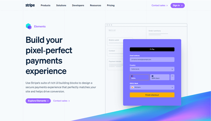
Stripe
Stripe’s payments page showcases animated gradients, which is a bold design choice. Gradient animations can be risky because they draw significant attention, but Stripe executes them with restraint, giving the page a distinctive look without overwhelming the content.
HUYML
The HUYML website uses a simple black-and-white animation that serves dual purposes. It functions as both a preloader and a hero image. Combined with bold, in-your-face typography and high-contrast colours, the result is a truly unique and memorable landing page.
This example proves that animation does not need to be complex or colourful to be effective. A strong concept with clean execution is often more impactful.

Codecards
The Codecards website combines dark mode with a clear educational purpose. The page helps developers learn new coding concepts through a card-based format. The visuals accurately represent the actual play cards, the copy is concise, and the CTA button stands out against the dark background.
Dark mode landing pages continue to be popular because they reduce visual fatigue and create a focused browsing environment, especially for technical audiences.

Perfect Portal
Perfect Portal demonstrates their award-winning digital client onboarding solutions through animated mobile screen mockups. All animations were created in SVGator, showing how easy it is to use mobile device mockups to showcase app functionality on a landing page.

MetaMusic
The MetaMusic website is designed to help musicians, publishers, and creatives learn about discoverability tools. As visitors scroll, a series of line animations come into view. The lines curve and intersect with each other, creating a dynamic visual display that is both aesthetically pleasing and functional.
This is an excellent example of using scroll-triggered line animations to maintain engagement throughout a long-form landing page.

Awwwards conference
The Awwwards conference page uses character animations that are fun, playful, and perfectly aligned with the event’s creative identity. From quirky animated characters to bold typography and colour, every aspect of the page is designed to build anticipation and excitement for the event.
Character animation is an underused technique on landing pages. When executed well, it creates an emotional connection that static illustrations simply cannot match.

Peanuts
The Peanuts Studio website features vivid landing page animations in every section. As a creative agency, their website serves as both a portfolio and a landing page, demonstrating their design capabilities through the browsing experience itself.
Creative agency websites are an excellent source of landing page animation inspiration because they push the boundaries of what is possible with web animation.

How To Create Animated Landing Pages With SVGator
Creating animated landing pages does not require coding knowledge or complex software. SVGator is a browser-based SVG animation tool that allows designers to create production-ready animations and export them as lightweight, self-contained SVG files.
The process for creating a landing page animation in SVGator involves four steps:
- Import or create your SVG artwork: Upload your static SVG file from Figma, Adobe Illustrator, or Sketch, or create vector elements directly in SVGator using the built-in shape and pen tools.
- Add animators to your elements: Select an element and add the appropriate animator, such as Position, Scale, Rotate, Opacity, Morph, or Stroke Offset. Place keyframes on the timeline to define the start and end states of each animation.
- Refine the timing and easing: Adjust keyframe positions, apply easing presets, and fine-tune the animation duration.
SVG animations exported from SVGator are single, self-contained files with no external dependencies. They require no runtime libraries, no JavaScript frameworks, and no additional player scripts. This makes them ideal for landing pages where performance and load speed are critical.
Final Thoughts
A well-animated landing page is more than an aesthetic choice. It is a conversion tool. The examples in this article demonstrate that landing page animation can serve many purposes, from guiding attention to the CTA, to explaining complex features, to building brand trust through polished visual design.
If you are ready to create your own animated landing page, SVGator provides everything you need to design, animate, and export production-ready SVG animations directly in your browser, with no coding required.
FAQ
Do animated landing pages load slower than static ones?
Not necessarily. The loading speed depends entirely on the animation format and implementation. SVG animations are significantly lighter than GIFs or embedded videos. A typical SVG animation file ranges from 5 KB to 50 KB, compared to GIFs that can easily exceed 1 MB. Using optimised SVG files ensures fast loading times and strong Core Web Vitals performance.
What is the best format for landing page animations?
SVG is the best format for landing page animations because it is resolution-independent, lightweight, and SEO-friendly. CSS-animated SVGs can even be indexed by image search engines, which adds an additional SEO benefit.
How do I add animation to my landing page?
You can create landing page animations using a no-code tool like SVGator. Import your vector artwork, add animators such as Position, Scale, Rotate, or Opacity, set keyframes on the timeline, and export as an SVG file. Then embed the animation on your landing page using an <object> tag for interactive SVGs, an <img> tag for CSS-only animations, or inline SVG for scroll-triggered effects.