Color banding is definitely one of the top five situations where a designer/animator is most likely to blow a fuse. If you’ve ever had to find ways to avoid banding in gradients, then you know the struggle! In this blog post, we outline 10 effective fixes and reveal the ultimate methods for achieving smooth, banding-free gradients without complex workarounds.
Table of Contents:
What Causes Color Banding in Motion Graphics?
Blur Doesn't Eliminate Color Banding in an Animated Gradient
How to Fix Color Banding in Gradient Animations?
SVG: The Ultimate Way Out of Color Banding Limbo
Finding the ideal countermeasure for a heavily banded gradient in a still image is an ordeal on its own, but throw animation into the mix, and you’re in for a rough ride. Banding is a visual artifact that most raster file formats (PNG, GIF, mp4, etc.) are prone to. We’re obviously partial to the SVG format, but we’ve been around the block long enough to still have plenty of firsthand experience with addressing banding issues in animated color transitions on the web.
It’s worth noting that no matter what file format you’re working with, banding remains heavily reliant on the resolution, color profile, and general display specifications of the devices your animations are looping on. This means the same gradient banding can be more or less noticeable on different screens. So, keep in mind: the goal is to tackle only the matters that we can control!
What Is Color Banding?
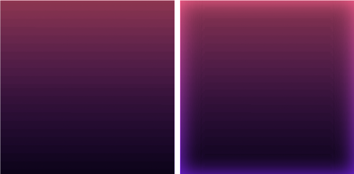
Color banding is an imperfection in how color is displayed in digital graphics. Banding typically becomes extremely noticeable in gradients that use colors that are very close to each other on the color wheel. When the colors are too similar, there aren’t enough tones available to create smooth color transitions inside a gradient fill.
Even subtle gradient banding can ruin an animation, mainly because once you see it, you can’t unsee it. And no designer wants to see a flaw in their design on an infinite loop!
Luckily, or maybe, unfortunately, we’ve all been in the same boat at one point or another – so there are a number of tried and true workarounds that you can test out. The bad news is that there is no “one size fits all” solution to color banding, which means your gradient banding context might require one or more steps to completely resolve the issue.
Is Color Banding the Same as Gradient Banding?
Yes, color banding and gradient banding are indeed the same thing. Both terms refer to the same visual issue in motion graphics, where a gradient fails to transition smoothly between colors, resulting in visible stripes or bands that disrupt the intended harmonious effect. This flaw is particularly noticeable in animations, where gradients play a crucial role in creating seamless backgrounds, realistic lighting, and nuanced shading, potentially diminishing the overall quality of the visuals.
What Causes Color Banding in Motion Graphics?
The main cause behind most of the gradient banding issues is compression. Exporting motion graphics as raster files (GIF, APNG, video, etc.) comes with a loss of fine details and imposes limits on the number of colors that get displayed.
Even lossless compression can absolutely ruin an apparently smooth gradient. GIF is particularly prone to color banding because it’s limited to a 256-color palette. By default, exporting an animation as a GIF will limit the number of tones the file has available to display your gradient – resulting in heavy color banding most times.
Why 256 colors, exactly? Going into bit-depth territory, 256 is the number of colors an 8-bit fully-programmable palette can support. 8 bpc is a default project composition depth setting, but motion designers can switch to 16bpc or 32bpc depending on the specifics of the project they’re working on.
We rely on compression in part to create performance-friendly files that won’t max out bandwidth or take ages to load on a website or in a mobile app. Clearly, the benefits far outweigh the loss of fine details, but this doesn’t make color banding any less frustrating.
A universal fix is out of the question when it comes to color banding in gradients, simply because there are too many variables at play. Even so, there is a “first instinct” approach that almost all designers/animators try their luck with. Let’s take a tiny detour to get the obvious out of the way first!
Blur Doesn't Eliminate Color Banding in an Animated Gradient
Instead of solving the problem, blurring often leaves you with fewer tones between the endpoints of your gradient. Blurring helps smooth color transitions between pixels, but it also reduces contrast, which can worsen color banding.
Adding blur to a banded gradient can actually worsen color banding, especially if you’re using color filters in your project as well, like curves or levels. You might just end up shifting the banding pattern, and stacking multiple effects can also lead to unexpected results. Furthermore, if your color banding issues are linked to a limitation in how the graphics are displayed, blurring will not fix the problem.
How to Fix Color Banding in Gradient Animations?
Now that we’ve touched on what goes on behind the scenes of digital color banding, let’s take a look at how you can avoid, manage and/or completely eliminate gradient banding in motion graphics – including the dos and don'ts of vibrant and smooth gradient animation.
Table of contents:
- Increase Color Depth a.k.a. Bit Depth
- Add Noise
- Tap Into Default Dithering
- Add Grain
- Get Out of the Dark Side
- Cut Down on Movement
- Add More Color Stops
- Get Rid of Zero Factor Percentages
- Identify Technical Limitations
- SVG: The Ultimate Way Out of Color Banding Limbo
Increase Color Depth a.k.a. Bit Depth
If the design tool/program you’re working with defaults to an 8-bit color depth, the first significant step you can take to smooth out color banding is to increase the Color Depth setting. Although this default setting works perfectly fine for most projects, and does a great job of keeping file sizes reasonable, it might be interfering with your project if you’re seeing heavy gradient banding.
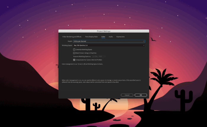
Given the fact that color banding is rooted in a limitation of the number of color tones available, increasing the number of bpc directly addresses one of the core issues that prevent the output of smooth color transitions.
| Pros ✔️ | Limitations ❌ |
|---|---|
| ✔️ Can address color banding when switching from 8bpc to 16 bpc (or more) | ❌ Bigger file size |
| ✔️ More colors available to fill in the space between the endpoints of your animated gradient | ❌ Not guaranteed to be a single step solution, especially in extremely dark gradients, because there aren’t enough tones to hide a lackluster tonal gradation (even with a 16bpc color depth) |
| ❌ The file might still be subjected to compression to make it on the web – which can bring the design back to square one |
Add Noise
Noise will help smooth the harsh edges of color banding by substituting the tones your design is lacking with tiny dots. These little “bridges” won’t bring new tones into the picture, so the colors of the dots will fall somewhere within the range of colors that your gradient animation already has available.
You can try this quick fix on its own, or you can give this optical trick the best chances of successfully eliminating color banding by increasing your project’s bit depth first. Another key adjustment that you’ll have to consider when adopting this technique is to figure out how much, or better yet, how little noise to use before you’re happy with the smoothness of your animated gradient.
The easiest way to fix color banding with noise is to start off with 1% and adjust progressively until the issue is almost completely resolved. The line between solving the banding problem and creating a new problem can be relatively thin.
| Pros ✔️ | Limitations ❌ |
|---|---|
| ✔️ A very efficient way to smooth lightly to heavily banded gradients | ❌ The % of noise it takes to fix harsh color banding can add too much noise, and ultimately take away from the beauty of a smooth gradient |
Note: This fix works best in tandem with increasing color depth to 16 bpc or more.
Tap Into Default Dithering
Dithering, in digital graphics, approximates the tones that are missing in a limited color palette and diffuses them between pixels, adding noise in the process. It’s basically an automatic way to add low levels of noise. Your design program of choice will dither your gradient animation when switching to a lower bit depth. This means you would create your project using a 16 bpc setting, and then switch to 8 bpc when exporting in order to mask slight banding.

Now, this might sound contradictory to the first two fixes above, but it works like a charm for subtle gradients and light color banding. It also takes tinkering with noise percentages out of the equation completely.
| Pros ✔️ | Limitations ❌ |
|---|---|
| ✔️ An automatic fix you can tap into simply by switching from 8 bpc to 16 bpc, and then back to 8 bpc | ❌ Works best with softer cases of gradient banding |
| ✔️ Adds natural noise, so you don’t have to figure out an ideal noise percentage | ❌ Can result in an increased file size |
Add Grain
Adding grain to your animated gradient works very similarly to adding noise. The percentage of grain you use to conceal a dreadful degree of color banding should be minimal. Choosing between noise and grain is mostly a question of preference, but the goal is the same: to fill in the gaps in color tones and create the illusion of a smooth(er) gradient.

| Pros ✔️ | Limitations ❌ |
|---|---|
| ✔️ Works on both lightly and heavily banded gradients | ❌ The % of grain it takes to fix harsh color banding can create an unpleasant sight. |
| ❌ Adding too much grain in an animation can increase file size because there isn’t enough steady information to compress |
Limit Gradient Fills to Smaller Areas
Let’s put things into a more practical perspective! A standard 15-inch laptop monitor has approximately 1440 pixels – for a green gradient background, a GIF file’s 256 shades of green couldn't display a smooth green gradient without banding. Simple math would dictate that you’d have a band of color every 5.6 pixels (1440 ÷ 256). A dark green gradient would leave you with maybe 6 out of those 256 shades of color, intensifying the banding.
It’s significantly more difficult to disguise banding in large gradient fills even with noise/dithering. If your project allows for this creative freedom, limiting your gradients to smaller areas will by default prevent severe cases of gradient banding.
| Pros ✔️ | Limitations ❌ |
|---|---|
| ✔️ A very efficient preventive measure for color banding in a gradient animation | ❌ Project-dependent, and it can limit your work as far as backgrounds, full-panels, or skybox fills go |
Get Out of the Dark Side
The laptop monitor example in the quick-fix listed above makes a good point of how the number of color tones available drops drastically when you enter the realm of pitch dark gradients. Brighter gradients have the advantage of being able to trick the human perception – the difference between two bright tones are relatively imperceptible compared to the absolute difference between two darker shades.
Fixing color banding on brighter gradients using dithering, for example, is easier as well. You have better chances of making the transitions between colors fuzzier and achieving a smoother blended look when working with brighter gradients.
| Pros ✔️ | Limitations ❌ |
|---|---|
| ✔️ Makes it simpler for you to solve color banding issues altogether | ❌ Can feel like a constraint, although it will save you plenty of time and hassle |
Cut Down on Movement
Compression is a triple threat for raster motion graphics! During compression, an encoder (the program responsible for optimization) will prioritize the information transmitted by the bits that are moving.
The bitrate of a video is like an upper limit on quality that also limits file size. If you have one or a few main subjects moving on a mostly static background, most of the available bits will focus on the animated parts, while the background pixels can be stored and reused. Chances are that the result will look good and have a small file size as well. Add in some dense snowfall, a moving grid in the background, or a huge gradient animation, and the available bits won’t be able to handle all the extra information. Blurry graphics, compression artifacts and significant banding are all likely to make an appearance in your final video. The more movement you have, and the lower your bitrate, the worse these compression side-effects will look.
Inter-frame compression has its merits, keeping raster file sizes manageable, but it’s not friendly toward heaps of fast-moving details.
| Pros ✔️ | Limitations ❌ |
|---|---|
| ✔️ Less movement in a design will keep your file sizes smaller, and prevent compression from ruining your GIF/video’s quality entirely | ❌ Limits your creative process, if you’re looking to create smooth gradients while sticking to raster graphic formats |
Note: This fix works best in tandem with restricting gradients to smaller areas in your designs.
Add More Color Stops
Introducing one or more additional color stops between your gradient’s endpoints will add to the number of tones that will make up the smooth tonal gradation you’re aiming for. This quick fix gets extra brownie points for also making gradients look more intense by getting rid of any dullness or muddy in-between tones.

| Pros ✔️ | Limitations ❌ |
|---|---|
| ✔️ Will counteract color banding and make your gradient animation look more vibrant and eliminate the duller middle-ground | ❌ Project-dependent;sometimes adding extra colors just doesn’t fit the bill |
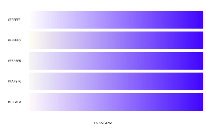
Get Rid of Zero Factor Percentages
Having one of your gradient’s endpoints set to “pure white” (#FFFFFF or rgb(255,255,255)) can cause a less problematic case of color banding, where you get a white cutoff band near the outer boundaries of your gradient. There’s an easy way around this less noticeable pitfall, and that is getting into the habit of working with off-whites. These hues can be ivory (#FFFFF0), whitesmoke (#F5F5F5), floral white (#FAF9F6), or snow (#FFFAFA), among others, depending on the other undertones your tonal gradation is made up of.
| Pros ✔️ | Limitations ❌ |
|---|---|
| ✔️ Easy way to make the edges of your bright gradients look smoother, with no white cutoff | ❌ Addresses only a small detail of the torment that color banding creates for graphic/motion designers |
Identify Technical Limitations
Switching between a monitor where color banding is a non-issue and a banding-riddled screen will make you realize you've been taking smooth gradients for granted all along! The possibility that the end-viewer of your motion graphics has a lower quality, defective, or miscalibrated monitor is objectively out of your control. Other external factors, such as low bpc color resolution system settings or off video card gamma settings are also out of your hands.
All the gradient banding workarounds we’ve touched on can be overturned by technical limitations on the end-user’s side. But the biggest technical threat continues to be the postproduction compression of raster graphics – the villain of the stories you’re telling with smooth animated gradients.
Luckily, there is a graphic format that doesn’t require tricks, witchcraft, or creative sacrifices to render flawless animated gradients, and that is SVG.
SVG: The Ultimate Way Out of Color Banding Limbo
You can become an unconstrained motion graphics storyteller by switching to SVG animation – with no need to cut creative corners in order to create smooth, beautiful gradients! There’s no lossless/lossy compression to speak of when it comes to animated SVG files. And as we’ve seen, compression is the culprit behind more than half of all color banding cases. Shifting to scalable vector graphics can give you a headstart, especially when working with animated gradients.
These performance and file size differences are relevant in the case of gradient banding because you’ll end up with an enormous bloated raster animation (GIF or APNG) trying to smooth a case of intense color banding, when you could instead get flawless color transitions at a fraction of the file size with SVG animation.
The reality is that SVG might not be a compatible substitute in all animation use cases. Animated raster graphics (APNG, GIF, video, etc.) serve multiple purposes perfectly fine. But in the context of gradient animation, there’s no better way around the constant color banding troubleshooting. SVG gradient animation has a leading edge over its raster counterparts:
| Banding Risk Factors | Animate: SVG Gradient | Animate: Raster Gradient |
|---|---|---|
| Compression | SVG animations are not subjected to lossy/lossless compression. | The compression of raster animations, and its after-effects, have a major negative impact on the smoothness of gradients. Lower color depth, color limitations, the quality loss caused by too many moving details, all intensify the problem of gradient banding. |
| Quick Fixes | SVG files are lightweight by default - and any color banding (if at all) can be remedied without changes in file size. | Fixing color banding in an animated raster graphic can bulk-up the file size significantly – whether you do it via dithering, or by adding noise, grain, etc. |
| Resolution | SVG is a resolution-independent graphic format. Scaling doesn’t negatively impact tonal gradation. | In high resolution animated rasters, the number of pixels needed to display a video/APNG can outnumber the total number of tones available for the gradient – a perfect recipe for intense color banding. |
Final Thoughts
Minimizing color banding in animated raster gradients is definitely possible – although the quick fixes will require you to cut your losses on file size, color sharpness, or the level of detail you can include in your animations. Switching to SVG animation makes the most sense when you’re constantly trying to find workarounds for problems that are non-issues in the SVG-sphere.
Save yourself from the annoying cycle of fixing color banding, and start creating the smoothest gradient animations with SVGator!