Becoming proficient in graphic design is a journey that requires patience, dedication, and a commitment to continual learning. Even after immersing themselves in a series of tutorials, aspiring designers often find themselves grappling with common pitfalls.
In this article, we’ll delve into these common graphic design mistakes and also offer examples of do's and don'ts.
Whether you're just embarking on your design journey or seeking to refine your skills, it's essential to recognize and correct these errors. Read this article to make sure you will never commit these mistakes again.
Table of Contents
- Creating an amateurish logo
- Using heavy files that lead to slow loading speed
- Not maintaining visual hierarchy
- Buttons in visual hierarchy
- Failing to maintain color consistency
- Using too many fonts
- Not using enough white space
- Bad kerning
- Blindly following trends
- Poor readability of text on photo
- Conclusion
1. Creating an amateurish logo
Logo design is a whole galaxy in the universe of graphic design; the do’s and don'ts for this field can fill endless pages, but there are some basic principles that all professionals would agree on.
Amateurs often make the mistake of adding too many elements and colors to their logos, as well as creating a logo that is too obvious for their industry. These cliches can make logos unoriginal and forgettable.
The world's biggest brands use just one or two colors in their logos and a few distinctive elements that are recognizable and readable even in a smaller size. The chosen font must align with the industry's expectations; this is the reason why brands in the same industry often use similar fonts.
 SVGator
Learn more about logos
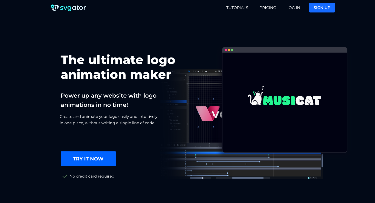
Give our logo animation feature a try!
2. Using heavy files that lead to slow loading speed
In today's fast-paced digital landscape, slow load time is the main cause of high bounce rates. The standard expectation for a website is to load within two seconds, so if your site exceeds this threshold, you should optimize it for better performance.
In general, we recommend compressing heavy content and consider using lightweight image formats where applicable.
For example, if you choose an SVG file or a Lottie animation instead of GIFs and videos, you can significantly enhance your page speed and reduce loading time.
Using SVG instead of JPG or PNG images can help you reduce the file size by up to 200% while maintaining maximum quality and scalability.
Lottie animations can be 600% smaller than MP4 and GIF while retaining the same quality. In general, they are 50% smaller than an average PNG, and they can be optimized for an even smaller footprint.
Daiana Neama
3. Not maintaining visual hierarchy
One of the most common graphic design mistakes is poor visual hierarchy. Elements such as lack of hierarchy in size, color, or shape, or unusual placement, can confuse viewers and won’t properly communicate the marketing message. Most designers know a thing or two about hierarchy, but many times they fail to actually use these techniques, or they just don't use them effectively.
An easy-to-remember golden rule is to consider the three main elements of your design. Ask yourself:
- Where will the viewer's eyes first focus on your design?
- What is the probable second point of interest?
- Where will their eyes ultimately settle?
This approach is fundamental for consistently creating impactful and effective designs.
The vast majority of designs loosely follow 2-3 techniques of hierarchy based on users’ most common content scanning patterns:
- the F pattern
- the Z pattern
- the layer-cake pattern
Each technique prioritizes important content and places it in the focal zones. Using headings and subheadings in the right way can significantly reduce the cognitive load, as well as negative space, which increases readability, establishes hierarchy, and emphasizes important elements.
We will discuss negative space in a separate section, but for now, let’s have a look at buttons.
4. Buttons in visual hierarchy
When you have more than one button, indicate each button's priority through various visual cues such as color, size, contrast, borders, and shadows.
- The primary button should be the most prominent element on the page. Floating action buttons typically signify the primary or most frequently used action.
- Secondary buttons represent actions that are slightly less important than the primary action. Use ghost or outlined button styles to convey their level of priority.
- Text buttons are the lowest in hierarchy; they are labels without containers.
5. Failing to maintain color consistency
Color is one of the most powerful and challenging elements of graphic design; choosing the wrong colors or being inconsistent can ruin your whole page. Two common pitfalls are using too many colors, which weakens the overall brand image, and not ensuring accessibility for individuals with color vision deficiencies.
A useful rule of thumb for establishing your color palette can be the 60-30-10 Color Rule. This rule chooses 3 colors for an interface in the following way:
- 60% of the interface should be a neutral or a base color: white or a creamy color for a bright interface, and a dark base color if you're doing a dark mode design.
- 30% should be a primary color: this might be a brand color.
- 10% of the color palette should be the accent color for CTAs and other important elements.
This color ratio helps to create a harmonious and visually appealing design, enabling smooth transitions between focal points. Moreover, it is straightforward and easy to apply.
According to Web Content Accessibility Guidelines (WCAG) level AA, normal-sized text should maintain a minimum contrast ratio of 4.5:1, with similar requirements for large text, icons, input borders, and other interface elements.
There are several accessibility testing tools to help you check your color contrast; for example, the Stark plugin offers a free version compatible with Figma, Sketch, Adobe XD, and Google Chrome.
6. Using too many fonts
We've all been there: starting out as designers, we’ve discovered an amazing set of fonts and felt the temptation to use plenty of them because they look so good. However, here's the catch: using too many fonts can quickly clutter your workspace.
Brand identity designers have the approach of choosing a typeface for its consistent appearance across various styles. In this collection, each font serves a different purpose. They can be bold, italic, and have different weights and widths.
However, we think that sticking to 3 fonts can create a better consistent flow of design even in this case.
7. Not using enough white space
Underestimating the power of negative space is a mistake that many designers make. Lots of amateur designers create overloaded pages with not enough white space, fatiguing the eye or confusing the viewer.
It also has psychological impacts: it influences the decision-making process, and it is able to make viewers feel calm and focused.
You can exploit white space to your advantage in the following ways:
- Create a focus with white space: direct the viewer’s attention by creating a space around a particular object. The greater the empty area, the more the human eye will be attracted to the element in question.
- Guide the user with hierarchy: white space is part of the visual hierarchy. Using it correctly will help you create an optical path to guide the user through the page.
- Improve understanding: proper use of white space helps to identify the groups of elements. It can separate or connect the different parts of a layout. Adding ample white space emphasizes the element’s importance in the composition, while a smaller space creates a kind of relationship between them.
- Have a specific style: white space has always been associated with a particular style of high quality and luxury. Premium brands such as Apple are taking advantage of white space, which helps them put their products in the spotlight.
- Ensure balance and harmony: white space is able to add a sense of cleanliness and lightness to any project, resulting in a simple and easy-to-understand layout that helps you communicate your message more effectively.
8. Bad kerning
Inexperienced designers often struggle with the spacing between letters or characters, also known as kerning. Many of the freely available fonts are poorly designed, and while they seem visually appealing at first, their flaws come to light upon use.
Poor kerning arises from a lack of understanding of the spatial relationships between letters, as well as neglecting the difference between straight and curved letters.
Letters can generally be categorized into three groups:
- Straight-edged
- Rounded
- Diagonal-sided
Conversely, when pairing two rounded letters, the space between them should be even smaller.
Diagonal-sided letters pose a challenge, as they create significant negative space, requiring precise kerning adjustments and high attention to detail.
Letter pairs that usually need kerning include:
- Capital T followed by lowercase o, a, or e
- W followed by a or o
- f followed by i or l
- r followed by y or t
9. Blindly following trends
Inexperienced designers frequently base their designs on current trends, which can result in their logos, websites, and other creations quickly becoming outdated, as trends evolve and change over time.
You can also apply some of the trends to your own style, which will make them unique and won’t be outdated in a few months’ time.
Knowing your audience can help a lot in determining what works best for your purpose. If you are designing for a young and adventurous audience, they will be more likely to love the latest graphics trends, while a more conservative style will suit the professional and formal target audience.
SVGator
It’s important to align the trends with your values, as well as with your client’s and their audience’s values.
10. Poor readability of text on photo
Various graphic design mistakes can lead to poor readability:
- One of them is using long lines of text.
- Try to stick to 50-60 characters per line and use strong headlines and bullet lists, and select easy-to-read fonts for the best user experience.
- Keep alignment consistent across each section, and reserve centered text for very short captions.
- You should also avoid using all caps in the body text.
Another common mistake when it comes to readability is mixing images and text without enough contrast ratio. The image and text combo might be a good choice for the hero section, but inexperienced designers may apply inadequate contrast, leading to poor readability.
When it comes to choosing photos, it is also important to note that one or two stock images are acceptable but use them only when you don't have any other choice.
Conclusion
We hope that by recognizing the pitfalls discussed in this article, you will be able to produce more effective and visually appealing work. Let's embrace the journey of growth and improvement as we strive to create amazing graphic designs that leave a lasting impression!
If you have any questions, feel free to contact us via email or find us on social media.