Neubrutalism is a web design trend that has been gaining traction in recent years, with its distinctive elements still prevalent today. Read this article to explore the origins, emergence, and influence of neubrutalist web design, and to see a visual guide with examples that showcase this bold design style.
Table of Contents
How did neubrutalism emerge as a web design trend?
How is neubrutalism related to brutalist design?
What are the main characteristics of neubrutalism?
The challenges of creating neubrutalist website design
Examples to neubrutalism in website design
What is neubrutalism?
Neubrutalism is a web design trend characterized by an extremely simplistic approach: using the raw building blocks of the web, relying more on HTML instead of CSS and JavaScript. It is a system of design thought that operates on the principles of strong impression and pure functionality, lacking any concern for comfort and completely ignoring traditional design layouts.
Its name is an unofficial term to the design style characterized by:
- High contrasts
- Powerful colors
- Huge fonts
- Strongly defined shapes
Neubrutalism is considered a true visual anarchy compared to minimalist design.
These websites tend to have minimal styling and reject tools such as TypeScript or SASS. Due to less CPU usage, neubrutalism can be considered quite an environmentally friendly design trend.
How did neubrutalism emerge as a web design trend?
Material Design system created in 2014 by Google set new standards for web design and defined every aspect of a user-centered, clear, and simple design both in apps and websites, leading to a modern minimal style. This approach has dominated web design trends for quite a long time, and many claim that it has started to become boring and overused. The need to find new alternatives led to neumorphism, glassmorphism, and skeuomorphism, which tried to break out but didn’t become real trends.
As Y2K mania has taken over pop culture, its influence started to show in web design aesthetics as well. The design community still has mixed feelings about those messy web graphics, sharp contrasts, and hard-to-implement designs, but this new wave has undoubtedly brought something new and exciting to the table. Namely, neubrutalism. This style seems to deliberately violate all the safe and clean layout rules and standards of modern minimal web design.
How is neubrutalism related to brutalist design?
Neubrutalism and brutalist design share a common foundation in their aesthetic principles, yet they differ in context and application. Neubrutalism can be seen as a modern evolution of brutalism, reinterpreting its core principles for contemporary design challenges and opportunities.

Brutalism has its roots in the 1950’s architectural style, which prioritizes function over form. It uses massive structures and showcases the bare building materials instead of any decorative design.
Brutalist buildings are commonly known to be unpainted and made of concrete and steel elements. Its name comes from the French term béton brut, which literally means “raw concrete,” and it was used mainly for institutional buildings.
What are the main characteristics of neubrutalism?
We might say that there are two types of designers: those who claim that stunning illustrations and other decorative elements are a must, and those who believe in the brute force of basic design elements and minimalistic approach. Neubrutalism evidently belongs to the second category.
The main characteristics of neubrutalism in web design are:
- Clashing colors
- Contrasts
- Strongly defined shapes and lines
- Unique typography
- Accented shadows
- Animation effects
- Focus on HTML
- Function over form
Clashing Colors
Neubrutalism just couldn’t care less if your eyes are bleeding from a clashing color combination of red and blue or red and green. It winds up all the principles of the user-friendly interface design with aesthetically pleasing, web-safe colors, that has graced our screens for many years now.
Contrasts
Brutalism web design isn’t afraid of high contrasts and pure black (#fff) or white (#000), which are often avoided in order to avoid eye strain. The mixing of black with contrasting colors is an especially widely used practice in brutalist UI design.
Strongly defined shapes and lines
In contrast to minimalist design trends, neubrutalism uses purposefully inconsistent and strongly defined shapes. Stripped down to the bare essentials, it is inspired by early HTML1 web designs, like computer window patterns.
Unique typography
Typography plays a very important role in neubrutalism. It behaves in a much more conservative way than in previous brutalist design styles, following the well-used typographic practices.
It has an excellent use of whitespace, often complimented by huge and bold fonts, pushing for maximum readability and moving away from minimalism’s softer approach. It is characterized by simple and unique fonts, and the text overflows other containers.
Accented shadows
Neubrutalist shadows are sharp and black instead of having blur on them. Buttons seem to have another pure black rectangle underneath, providing that “in your face” contrast instead of a barely visible border. It is also noticeable that most shadow or fake 3D objects use isometric views that are in a 45° angle.
Animation effects
Neubrutalism favors animations that are as bold as its visual style. Movements are often sharp and pronounced, reflecting the strong geometric lines and heavy contrasts typical of neubrutalist design. This could manifest in sudden transitions, dramatic reveals, dynamic background changes.
For example, a button might enlarge or change color when hovered over. Parallax movements, fake 3D effects and shadow play are used to create a sense of depth and dimension.

Focus on HTML

Neubrutalism favors a minimalistic approach, often using plain HTML instead of CSS and JavaScript. This functional aesthetic echoes the utilitarian nature of Brutalist architecture. Clear, semantic HTML directly presents content without hidden layers.
The challenges of creating neubrutalist website design
From a design perspective, neubrutalism seems approachable to beginners due to its simplicity and basic forms, but finding the sweet spot in visual hierarchy might be a challenge even for seasoned professionals. If it is done incorrectly, it may lead to a chaotic, disturbing, and frustrating user experience.
The unconventional design solutions can cause difficulty to those visitors who are not tech-savvy, because CTA buttons and navigation aren’t always in the obvious place.
The questionable color choices and bold shadows require a bit of work for their brains to process.
It’s ideal for an audience interested in design, arts, and fashion, but it’s a bad choice for fields like finance, healthcare or banking, where clear navigation and structure are important.

Avoid these graphic design mistakes.
Examples to neubrutalism in website design
We’ve put together this list of examples of neubrutalism in order to show you the many different approaches, styles, and layouts associated with this trend.
Pattern Brutalist

If you would like to learn more about the roots of the neubrutalist trend, check out this illustrated magazine inspired by brutalist architecture. Designer Sergey Lisovskiy created the illustrations of four Brutalist buildings from Russia, Germany, and Serbia, using animated GIFs, old photographs, and amazing graphic art.
Allcaps

Allcaps is an international typeface publishing collective. Their website uses black and white neubrutalist style and huge text blocks, which offers the perfect opportunity to have the typefaces in full spotlight without any distracting elements.
Budapest Park

The Hungarian capital’s most famous concert venue has a really cool brutalist website with clashing red and blue sections and basic geometric shapes. Dropdown sections have thick black borders and hard shadows, creating that infallible layout.
Alias

The French concert producer’s website was inspired by the neubrutalist trend, using pure black buttons and huge fonts to be in line with the brand’s awesome urban look. The colorful hover animations add an extra dynamism to the user experience.
Cromier

The Italian sneakers brand describes its products as a “mix & match of colours and materials for a result that shouts urban-chic allure.” This is also reflected in their website design: glitch animation effects combined with asymmetrical and layout perfectly capture that laid-back attitude.
Megafauna

The digital agency is a sub-brand of Lattimore and Friends. It offers SEO, digital campaigns, hosting, and maintenance services. The minimalist design together with the catchy headline and short creative copy are doing a really good job at presenting the company’s vision and unique approach.
Sita Abellan
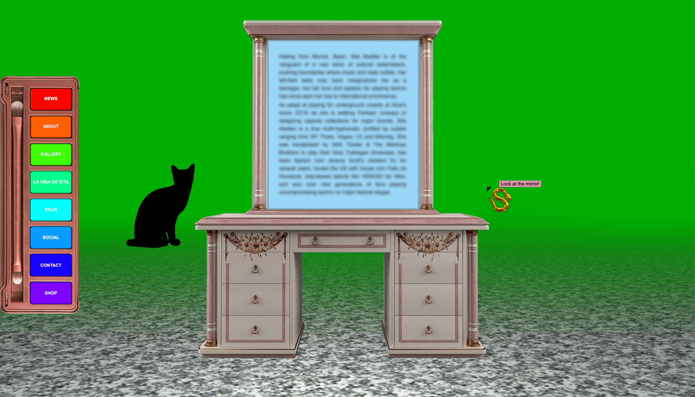
The Spanish model, DJ, and designer is an eccentric Instagram sensation with an eclectic style and colorful outfits. Her unique apparel is reflected by her brutalist website inspired by 90’s Windows layout and games, where every page has its own unique style and interactions.
The annoying cursor, the clashing colors and eyestraining elements take the viewer on a challenging journey full of surprises. Open at your own risk!
The Great Lake Michigan

This nice neubrutalist website was created to share fun facts about Lake Michigan.
The animated and color-coded sections appear on scroll into view and do a really good job of keeping the viewers engaged. The stunning design elements, interesting photos, and huge fonts are continuously teasing you to go on till the end.
Gumroad

When it comes to brutalism in web design, Gumroad is the first website that you might think of. Its interesting approach and unique style has become an example for those who would like to explore and try brutalist website design.
Muted, clashing colors, thick black outlines, modern typography, and mixing various illustration styles all contribute to Gumroad’s successful design.
Plus

This special product calls for an outstanding website. The dissolvable body wash sheets are presented on a blue and red dominated page with nice animated elements. Similar to Gumroad, it merges different illustration styles, videos, and photos in order to achieve a powerful impression and entertain the visitors.
Badass35

This website is a good example of the “ugly on purpose” idea embraced by brutalist UI design. The disturbing yellow background and the oversize fonts are spiced with scroll animations and artistic photos.
The website’s neubrutalist design is in accordance with the wedding photographer’s mission to capture what is “really happening instead of imposing any narrative.”
Conclusion
All in all, normalizing the ugly seems an interesting idea to explore and embrace. Even though neubrutalism fits only a couple brands, you can still integrate some elements of it into your project and merge them together with other styles.
Are you ready to try this relatively new aesthetic? Tell us more on Facebook, Twitter, Instagram, or Reddit!