
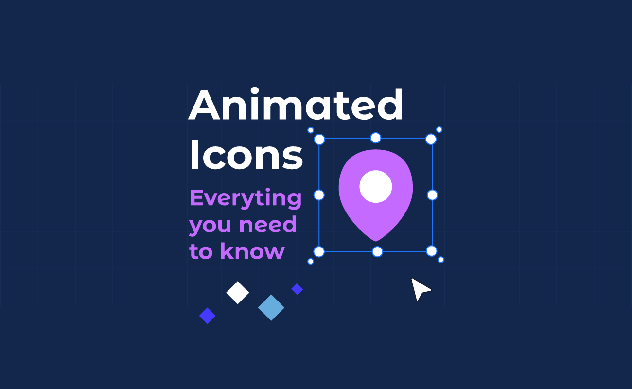
Animated icons are motion-enhanced UI symbols that help users understand actions, states, and navigation faster than static visuals alone. In product design, they are used for microinteractions, loading feedback, onboarding cues, and status indicators across websites and apps, improving clarity without adding extra UI copy.
This guide breaks down what animated icons are, how they work, where they fit best in real interfaces, and what to consider for accessibility, performance, and user experience.
Table Of Contents
Animated Icons Vs Static Icons
What Are Animated Icons?
Animated icons are small, graphic symbols that move. They can pulse, morph, bounce, rotate, fill up, or transition between states to communicate something quickly. Think of a heart that pops when you tap Like, a hamburger menu that turns into an X, or a download icon that fills as a file completes.
When used thoughtfully, an animated icon delivers instant, intuitive feedback by signaling the outcome of an interaction, the current system state, and the next step the user can take.
How Animated Icons Work
Animated icons are usually built as vector artwork or image sequences, then animated with a format or technology that matches the product.
Common ways they are made and delivered:
- Animated SVG: SVG icons animated with CSS or JavaScript. Good for crisp, scalable icons and simple motion like strokes, transforms, and morphs.
- Lottie JSON: Ideal for smooth, lightweight vector animations and especially popular for mobile app interfaces.
- CSS animations: Perfect for UI icons that can be built from basic shapes or SVG and animated with keyframes.
- Sprite sheets or short video loops: Sometimes used in games or highly branded experiences, but usually overkill for everyday UI icons.
How they behave in a real interface:
- Triggered by an event: tap, hover, scroll, page load, form submit, success, error.
- Play a state change: idle to active, off to on, collapsed to expanded.
- Use motion principles: easing, timing, and short durations, so they feel responsive instead of distracting.
- Can be looped carefully: for loading, processing, or “waiting” states, ideally with a clear end state.
Why Use Animated Icons?
Animated icons earn their spot when they reduce confusion or make an interaction feel clearer and more satisfying.
Reasons teams use them:
- Clear feedback: A subtle checkmark animation after saving tells users the action worked.
- Better affordance: Motion can hint that something is clickable or expandable.
- Faster comprehension: A single icon that transitions between states can communicate “play vs pause” instantly.
- Improved perceived performance: A lightweight loading animation makes waiting feel shorter.
- Brand personality: A consistent motion style can make a product feel more polished and recognizable.
- Reduced UI text: When done well, motion can replace extra labels.
When not to use them:
- If the motion does not explain anything.
- If they compete with the main content.
- If they might trigger motion sensitivity, and you do not provide a reduced motion option.
Where Animated Icons Are Used
Navigation And Menus
Animated icons help users track state changes in navigation. For example, a hamburger menu icon can smoothly morph into an X when the drawer opens, then back when it closes. A chevron can rotate to show an accordion expanding, which is especially helpful in mobile settings screens where space is tight.
Buttons And Call To Action Feedback
Micro animations confirm taps and clicks without extra popups. A “bookmark” icon can flip from outline to filled with a tiny bounce. A “send” paper plane can lift off briefly after a message is sent, paired with a quick success state, so users know the action is completed.
Loading And Progress Indicators
Animated icons shine when something is happening in the background. A download arrow can turn into a circular progress ring, then become a checkmark at 100 percent. A cloud icon can animate lightly during sync and stop once everything is up to date.
Guidance Explainer Icons
Explainer icons are in-flow visual cues that support key steps in a process, helping users understand what is happening, what the system is doing, and what they should do next.
Notifications And Status Signals
Motion can communicate urgency without shouting. A bell icon might do a small shake when a new notification arrives, then settle. A warning icon can pulse once on error instead of flashing repeatedly, which is less stressful and more respectful.
Onboarding And Feature Discovery
Animated icons can teach interaction patterns quickly. A swipe gesture icon can animate a finger swiping left to reveal actions in a list. A camera icon can animate a quick focus ring to show “tap to focus” in a photo feature.
E-commerce And Checkout
In shopping flows, confidence is everything. An “add to cart” icon can animate a small item motioning toward the cart, then update the cart badge. A payment icon can animate a lock closing on successful verification, reinforcing trust at the right moment.
| Use case | What the animation communicates | Example |
| Navigation and menus | Open vs closed state | Hamburger morphs into X |
| Buttons and CTAs | Tap confirmation | Heart pops on Like |
| Loading and progress | Work in progress | Download turns into progress ring |
| Empty states | Guidance and tone | Inbox gently animates with hint |
| Notifications and status | New or important info | Bell shakes once, then stops |
| Onboarding | How to use a gesture | Finger swipe animation |
| Search and filters | Active state clarity | Filter icon shows active badge |
| E-commerce | Action completion and trust | Add to cart motion plus badge update |
Animated Icons Vs Static Icons
Animated Icons
Animated icons are most useful when the interface needs to communicate change. They can show cause and effect in a way static visuals cannot, such as confirming that a tap worked, indicating that something is processing, or revealing that a control has switched states. This makes interactions feel more responsive and can reduce uncertainty, especially in moments like saving, syncing, downloading, or toggling settings.
The tradeoff is that animation adds design and engineering overhead, and it must be used with restraint. Too much motion can distract from content, feel gimmicky, or create accessibility concerns for users who prefer reduced motion. Animated icons also require careful performance tuning, so they remain smooth across devices.
Static Icons
Static icons excel at clarity, consistency, and speed. Because they do not move, they are predictable and easy to scan, which is valuable in navigation bars, toolbars, dense dashboards, and any UI where users need to find actions quickly. They are also simpler to implement and test, and they typically have minimal performance impact.
The downside is that static icons do not inherently communicate state changes or progress. Without supporting UI feedback, users may miss that an action succeeded, or fail to understand that the system is busy, which can lead to repeated clicks, confusion, or unnecessary friction. In many cases, static icons work best when paired with other cues like labels, color changes, or inline status text.
Examples Of Animated Icons
Animated icons show their value best in real interface moments, where a small motion can clarify intent, confirm an action, or communicate status instantly.
How To Animate Icons
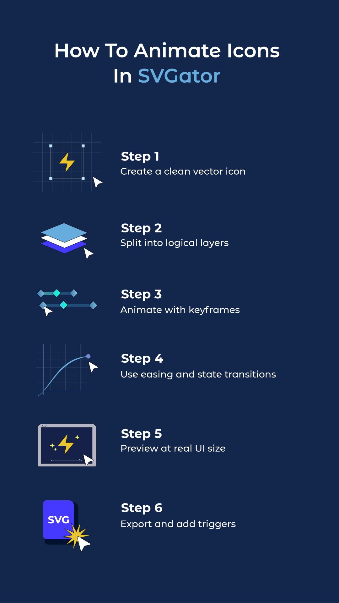
How to create an icon morph animation | SVGator
Final Thoughts
Animated icons make interfaces feel clearer and more responsive when they follow a consistent motion system with simple rules for timing, easing, and where animation is allowed. To keep production efficient, creative teams rely on tools like SVGator to design and animate icons in one place, then export lightweight assets.
FAQ
Do animated icons work on mobile phones?
Yes, animated icons work on mobile phones and are extremely popular in mobile app design. They're optimised for touch interfaces and provide crucial feedback for tap actions where hover states don't exist. Just ensure they're tested on various devices and remain smooth on older phones.
Can I use animated icons in emails?
Animated SVG icons have limited support in email clients. Many email providers strip out animations for security reasons. If you need animated icons in emails, consider using animated GIFs instead, though they'll be larger files and lower quality.
Can I animate PNG or JPEG icons?
No, you cannot animate PNG or JPEG icons directly because they're raster image formats made of pixels, not vector paths. To create animated icons, you need vector formats like SVG that define shapes mathematically.