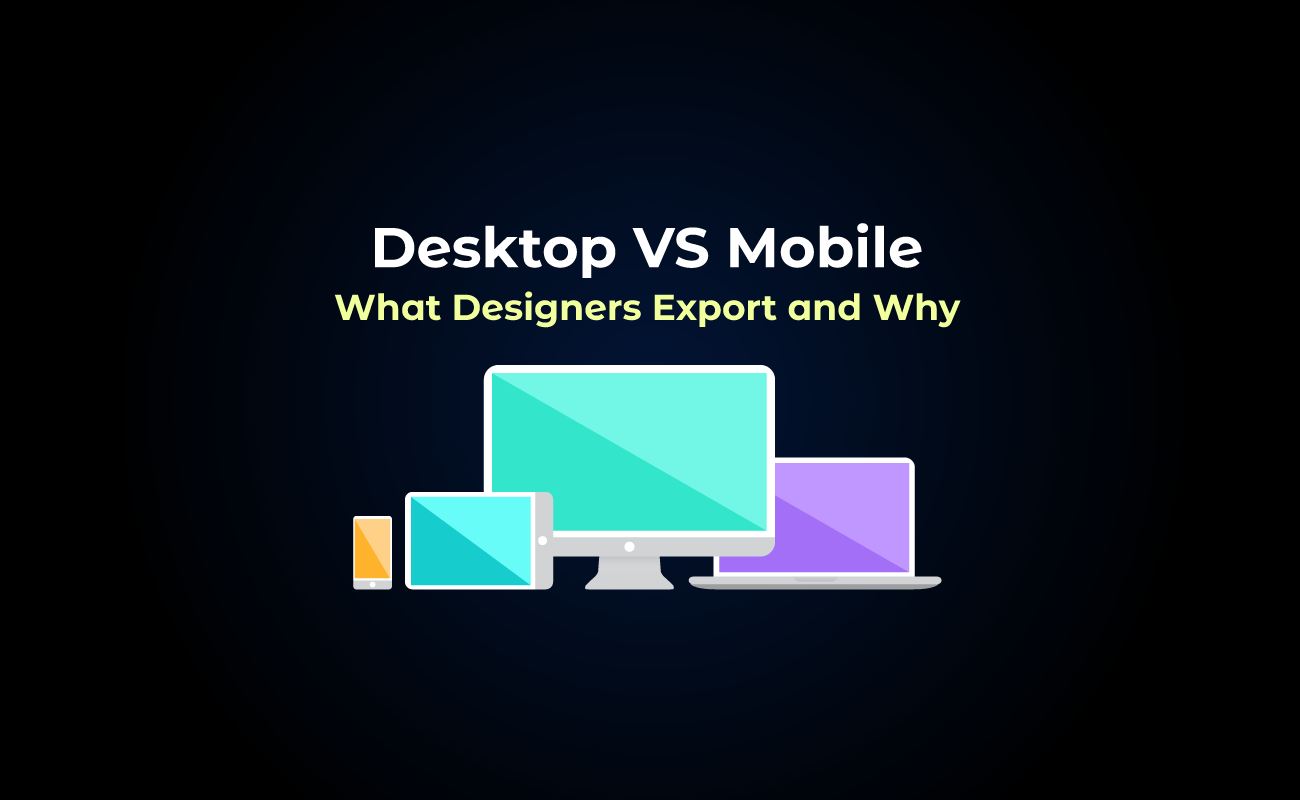

When designing animations for desktop and mobile, creators often need to adjust how they create and export them. Each platform and device has its own performance limits and user expectations, so understanding these differences ensures animations use the right formats, have optimized file sizes, and feel smooth and natural.
TABLE OF CONTENTS
Why export habits differ between desktop and mobile
Format preferences usage on desktop vs mobile
Why export habits differ between desktop and mobile
Designers often approach desktop and mobile animations differently because the contexts and limitations of each platform vary.
Desktop environments usually allow for more detailed, complex animations because screen sizes are larger and performance demands are less restrictive.
Mobile devices, by contrast, require designers to balance visual richness with efficiency, considering memory and network performance. These differences naturally shape how animations are exported.
Format preferences usage on desktop vs mobile
SVGator data shows that animated content is still mainly designed for web and desktop experiences, where detailed visuals and storytelling effects are more common. Designers favor desktops for their ability to handle complex animations, while mobile versions are limited by concerns such as file size, performance, and loading speed. However, as mobile technology improves, this gap may narrow.
Desktop format preferences
For desktop animations, designers often favor SVG or Lottie JSON, formats that maintain high precision and scale well for web interfaces. Desktop users can generally handle larger file sizes without noticeable performance issues, making these formats ideal for detailed, interactive animations on websites.
Mobile format preferences
For mobile, designers tend to prioritize formats that are lightweight and performance-friendly, such as optimized vector animations with reduced complexity. Mobile animations need to load quickly and run smoothly on a variety of devices, so minimizing file size and simplifying motion is critical.
Lottie has become the go-to format because its lightweight JSON structure keeps file sizes small, which is crucial for mobile performance, and its broad compatibility with multiple app frameworks allows for quick and easy implementation.
In contrast, Flutter and React files tend to be more developer-focused and require tighter integration within their respective frameworks. However, SVGator provides optimized, ready-to-use files that can be easily implemented in React and Flutter projects, offering developers high-quality visuals along with greater control over how animations interact with the app’s code and user interface.
Animation types and use cases
Icons
Icons can make navigation feel more intuitive and interactive.
- Desktop: Use SVG or Lottie files with higher frame rates (60fps) for smooth, detailed animations.
- Mobile: Compress Lottie files and limit frame rates (30–40fps) to save battery and maintain performance.
Although export frame rate affects vector animations differently than raster ones, they still need a refresh rate for display. Even though vectors are mathematically defined, they must be rasterized for the screen, rendering at a specific framerate—commonly 24, 30, or 60 fps.
Loaders and progress indicators

Loaders help users understand that a request is being processed.
- Desktop: You can use detailed animations with gradients or subtle shadows.
- Mobile: Stick to lightweight vector animations and shorter loops to reduce CPU/GPU usage.
Page transitions
Page transitions make navigating between screens feel fluid.
- Desktop: Full-screen effects, parallax, or complex easing can enhance the experience.
- Mobile: Simplify to sliding or fading transitions to maintain smooth performance.
Background or decorative animations
Background animations add subtle movement without distracting users.
- Desktop: Full-resolution videos, particle effects, and higher frame rates are fine.
- Mobile: Limit layers and opacity effects, using lightweight Lottie files.
Animated charts and data visualizations
Animated charts highlight changes in data and make information more engaging.
- Desktop: Complex morphing animations and interactive hover states are possible.
- Mobile: Animate only key transitions and keep interactions simple for readability.
Hero section animations
Hero animations grab attention at the top of a page.
- Desktop: Full-motion videos or advanced SVG animations create a strong visual impact.
- Mobile: Use optimized Lottie files to avoid draining bandwidth.
Microinteractions

Microinteractions give feedback for actions like button presses or toggles.
- Desktop: Smooth hover effects and transitions work well with CSS or JS.
- Mobile: Keep interactions short (100–200ms) and simple to avoid lag on touch screens.
Export settings differences
Desktop exports often prioritize:
- High precision and smooth vector scaling
- Full color fidelity
- Complex animations with multiple layers or effects
Mobile exports focus on:
- Optimization for smaller file sizes
- Reduced complexity in motion paths and layers
- Compressed assets to ensure faster loading and minimal impact on device resources
Designers adjust these settings based on the end platform, balancing quality with usability and performance.
| Setting | Desktop Format | Mobile Format | Notes |
| File Format | SVG, Lottie JSON | Optimized vector formats, Lottie JSON, GIF | Desktop can handle larger, more precise files; mobile needs lightweight, fast-loading formats |
| File Size | Larger, can exceed 1 MB | Smaller, often <500 KB | Mobile devices require fast loading and low memory usage |
| Animation Complexity | Multiple layers, masks, effects | Fewer layers, simplified paths | Mobile devices struggle with highly complex animations; desktop can handle detail |
| Color & Gradients | Full fidelity, complex gradients | Simplified gradients, fewer colors | Mobile optimization may require flattening gradients or reducing colors |
| Looping / Duration | Long loops or full sequences | Short, snappy loops | Mobile interactions often benefit from brief animations |
| Easing / Motion | Advanced easing, custom curves | Simpler easing functions | Simplified motion ensures smooth playback on lower-end devices |
| Scaling / Responsiveness | Full vector scalability | Scaled to target screen sizes | Desktop can adapt dynamically; mobile often optimized for specific resolutions |
| Compression / Optimization | Minimal compression | Aggressive optimization | Ensures mobile files load quickly without sacrificing too much visual quality |
Best practices
Designing for the mobile environment
1. Optimize for performance
Reduce file size by removing unnecessary layers and simplifying vector paths. Avoid complex easing curves or long-duration transitions that may cause frame drops. Use hardware-accelerated properties like opacity and transforms instead of heavy filters or shadows.
2. Use lightweight formats
Choose animation formats that are high-quality and optimized for mobile. Lottie, .dart (Flutter), or .js (React Native) work well for scalable, vector-based animations. Optimized GIFs can be used for short, looped visuals when vectors are not necessary.
3. Simplify motion and focus on clarity
Mobile screens are small, so clarity matters more than complexity. Prioritize clean and readable movement that guides user attention without distraction. Avoid overly detailed micro-interactions that can appear cluttered or hard to follow. Keep motion duration short, ideally under 500 milliseconds, for natural and responsive feedback.
4. Test on real devices
Always preview and test animations on physical mobile devices. Check for load time, responsiveness, and battery impact. Test across multiple screen sizes and operating systems such as iOS and Android to ensure consistency.
Designing for the desktop environment
1. Leverage processing power wisely
Desktop systems can handle more complex animations, but balance visual richness with performance to maintain smooth experiences. Use GPU-friendly effects and avoid unnecessary large image sequences. Optimize assets for different browser rendering engines.
2. Choose the right animation format
Select formats based on design and performance needs. SVG or Lottie works well for scalable vector animations that remain sharp on large screens. CSS and JavaScript animations are suitable for interactive UI elements or transitions. Video formats such as MP4 or WebM should only be used when necessary and should be compressed for streaming.
3. Prioritize user experience and accessibility
Even on desktop, motion should serve a purpose. Ensure animations support usability by providing visual feedback or guiding navigation. Include reduced-motion options for users with motion sensitivity. Avoid excessive looping or flashing effects that can cause distraction or discomfort.
4. Test across browsers and devices
Performance can vary between browsers, so test thoroughly. Check animations on Chrome, Safari, Firefox, and Edge. Validate timing, playback smoothness, and responsiveness across different screen resolutions and monitors.
Final thoughts
Desktop animations still favor detail, precision, and complex motion, while mobile focuses on lightweight, performance-friendly formats that load quickly and run smoothly. SVGator data shows Lottie JSON dominates mobile exports, reflecting the need for efficiency and easy implementation. The key trend is balancing creativity with practicality, and using tools like SVGator helps designers deliver high-quality animations optimized for both desktop and mobile.